The Rules Of Colour Clashing
How To Get It Right
Vibrant colour-clash interiors are always striking but decorating with clashing colours isn’t for the faint of heart. We’ve pulled together the rules of how to decorate with opposing shades with expertise from Gemma Drury, Creative Lead Designer at Ashley Wilde and KAI fabrics. With her advice you can create a colourful interior décor that’s bold, balanced and well-executed.
Tonal strength
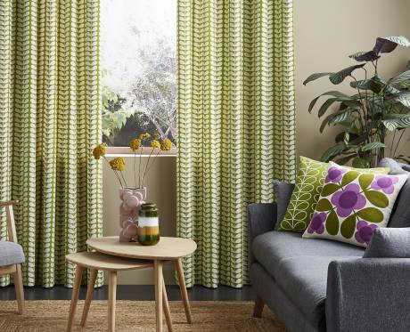
Start by selecting a pair of dominant colours that contrast with each other, for example a deep navy and a canary yellow or a lurid chartreuse with a hot fuchsia shade. For true colour clashing impact you should select colours on opposing sides of the colour wheel but the most important thing to keep consistent is their tonal strength.
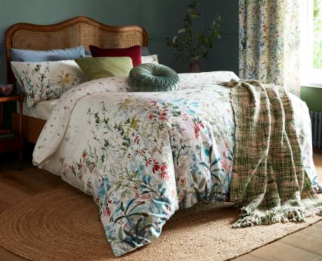
Gemma says, “Subtle tones of opposite shades are just as effective as brights. A jade green with a blush rose makes a strong pairing while lavender and terracotta accentuate the character of each other beautifully. You want to create a sense of tonal balance as this will tie the scheme together.”
Perhaps start by looking at the Ashley Wilde Asina 2 collection as there are over 73 colours to choose from to compare and contrast.
Subtle surprises
The eye carries colour so when decorating your home with contrasting shades make sure you echo these throughout your décor so it doesn’t look chaotic. Gemma says, “One way to stop this from becoming repetitive is to add an off-kilter shade that electrifies the intensity of your dominant colours. For example if you’re using turquoise and violet, choose a shade that’s in between them like a burnt orange or gold. This will surprise the eye and add visual interest.” For example, a sofa upholstered in a jacquard velvet like Konrad in gold paired with cushions in cool shades like Tallis Hydro and Heather from the KAI Tallis collection, are sure to lend a warm character to your living room.
Temper your tones
Sometimes colour clashing works best when you choose a simple palette of two contrasting tones and select accessories in light and dark shades of the same colour. Gemma says, “Fabric is a fantastic way to communicate your colour clash scheme. Try layering an armchair in a fabric like Vig sunshine from the Zenna Collection with cushions in peacock or a rich navy from our Letino collection.
This combination, when paired with a pale navy rug and curtains in a contrasting embroidery like Lazio Sahara will mean the opposing shades echo each other without competing.”
Test your metal
It’s easy to overlook metallic tones but these shades are an excellent choice if you want to create a sophisticated colour clash. Gemma says, “Lighter metallic tones like frost and silver can really sing when paired with more sultry irons and coppers. That’s what I love so much about the KAI Mica collection. It adds sheen and texture and brings light and dark into your soft furnishings.”
Most often we commit to a single metallic shade be it rose gold, silver or chrome, but by combining and clashing various metallic hues, you can add layers of tactile colour. Whether you’re incorporating metallic accents into your soft furnishings, or are adding character with high shine copper floor lamps or gold accessories, this approach is both subtle and chic.
Don’t neglect your neutrals
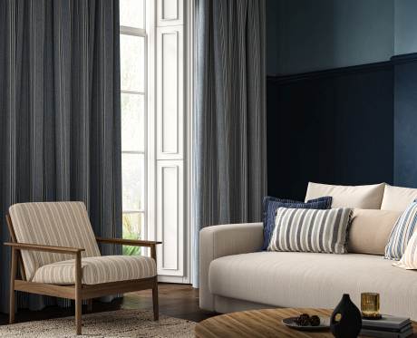
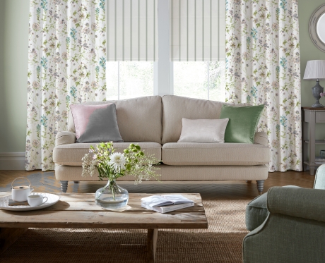
If you’ve committed to a clashing colour scheme never forget there’s a place for calm. Gemma says, “Clashing colours look best in the home when they’re not overdone. Make sure you add neutrals to create balance.” Having light, neutral curtains like these ready made ones in oyster from the Ashley Wilde Vittata collection and plain walls in ivory or oatmeal, can often mean your colour clash accessories work much harder for you.